Visitor Analysis and Persona
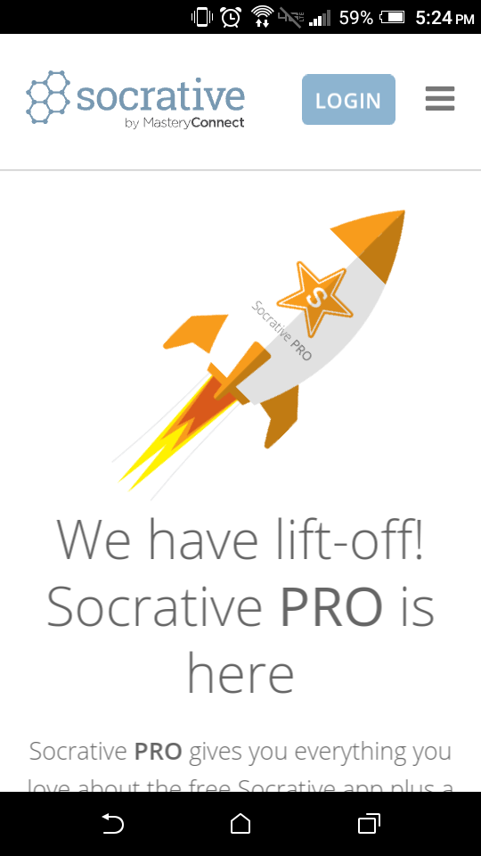
Socrative
Socrative WebpageVisitor Analysis
Who is using the site?
The majority of visitors using the website are college students ages 18-25 who are undergraduates with little to no income.
The target audience may or may not be married, but getting married is kind of a thing at certain universities, (BYUI), and so there will definitely be those who are married and have just started families.
The content on the website is very simple, but even so, the college students somehow find a way to make it a complicated service to use.
What is the visitor doing when he/she visits the site?
***Typically users will be in a classroom setting when they use this website, but hypothetically speaking we can assume the following based on where they are.***
When you're are at home, using a desktop or laptop machine, you will have the added experience of a bigger screen with more displayed on it at one time. The website is enhanced slightly, but all the same functions are still there.
There won't be any problems using this website from a tablet or phone, right before bed, if indeed you hypothetically had an online course where they used socrative late at night.
You can literally use this website anywhere. If you are traveling, and near bright sunlight for instance, it's not very complicated to still know what you are doing because the layout and functions of the website are so basic.
If you find yourself in a restaurant while eating, and need to fill out a survey question that your online course is polling on the spot, you go right ahead, Socrative has got your back.
Looking at Socrative on a gigantic display screen would certainly be a joy for anyone because the design is so appealing, yet simple.
If you're in the public library using your laptop, the experience will be just as grand as you can imagine. The webpage looks great on a laptop screen as its design is to perform on all devices.
What actions or content is the visitor wanting?
Imagine the technology behind the "ask the audience" option in game shows, only in your classroom. That's what Socrative is in a nutshull.
Socrative caters to professors in the teaching profession so they can create surveys and take polls on questions they ask in class. Socrative quickly allows students to login to their professor's "room" and answer the question presented by the professor.
One of the biggest benefits to Socrative is that the teacher can get an idea of how the class is processing what they are learning by throwing out a quick quiz and then reading the poll to see what the results of the class are.The professor gets results and the students don't feel nervous about answering honestly because it is all anonymously entered.
Where is the visitor located?
The visitor can be anywhere and in anyplace, but generally speaking they will be within the confines of a classroom.
The location of the visitor will not impact the performance of the website or the user experience.
When is the site being visited?
The time of day will impact the performance only if students who are in class have not gotten adequate sleep the night before. If it's a 7:45am math class, the students may be tired. (:
How are users accessing the site?
Users typically will be accessing the site using their smartphones, but tablets are also quite common, and so are laptops depending on the class you are taking. Specific brands of smartphones will vary greatly from the most basic cheap one to the newest iphone, but all will be catered to by Socrative.
Persona
Key Persona One: Brigham Young University Math Professor
Nikola Duradovic is a college professor in the discipline of math. He is 44 years old, married, and has eleven children. He graduated from Minnesota State University with a Ph. D. in Mathematics.
Nikola Duradovic enjoys teaching at the college level because he is allowed the opportunity to utilize the technology that the students have. He often will create short pop-quizzes that he then can offer to the individual students, and the students at large. He is very concerned about what the students are retaining during his lectures and he likes to see progress along the way.
He likes to allow students the chance to share what they know in a way that will allow those students who normally wouldn't speak up to have a say. He wants his students to succeed and while he isn't very good at technology himself, he knows that technology is a motivator for his students and so he wants to use their interest to keep them involved. He is willing to learn how to use basic applications on his school computer and smartphone in order to help his students stay attentive.
"The longer I teach, the more the numbers add up that I don't know much about technology."

Contrast
Official Website of the National Football League
What was the worst site you came across during the 24 hour mobile browsing experience?
Official Website of the National Football League
URL: NFL Website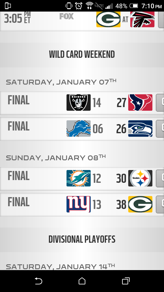
How did your best site differ from the worst in knowing who their target audience was?
The Socrative mobile website was super simple and user friendly to learn. It took about two seconds for me to learn how the website worked.
The NFL website failed to recognize their target audience accurately because they should know that people will want scores and news about the league's players, and they are going to want it everywhere they go.
Mobile is a must and if the mobile webpage appears jumbled, with the words breaking at unnatural points, then your visitors will become frustrated. The NFL mobile webpage also appeared super cluttered in contrast to the Socrative mobile webpage.
How did your best site differ from the worst in meeting the needs of their audience?
The Socrative mobile webpage meets the needs of the visitor by being simple and easy to understand. Like I said before, it took just two seconds to memorize how the website worked. If a visitor can learn the website fast, then they will stick around longer. Generally speaking, both mobile websites met the needs, but it was much more painful even looking at the NFL page.
How did your best site differ from the worst in organizing content to facilitate it being found?
If the website appears super busy, such as in the case of the NFL mobile webpage, then it takes a toll and becomes exhausting for the visitor trying to search for and read the articles. Things were orderly on the Socrative mobile webpage, and weren't on the NFL mobile webpage. If you want to keep the visitors happy, you need to simplify the mobile webpage, even take things out if necessary.
How did your best site differ from the worst in facilitating visitors in a mobile environment?
In order to best answer the question of contrast between the mobile webpages in facilitating to the visitor's needs, I am going to provide two examples that prove my point.
Then I click on the "schedule" tab of the navigation bar while on the NFL mobile webpage, I am brought to a screen that displays the schedules. The only problem is that the schedules go off the screen to the right, and it won't even let me scroll to the right to view the rest of the schedule! The least they could do would be to allow me to scroll, and even that the typical user will find extremely agravating. Little screens are frustrating on mobile webpages that aren't designed to facilitate to the user's needs.
In contrast to the previous example, when a visitor travels to the Socrative mobile webpage, they are met with a clean environment that allows them to do exactly what they came to accomplish. When I needed to use this on my phone today in class, I was able to login to my professor's "room" and make my selection from the options in the survey, without any hiccups--or words traveling off the screen.
Visitors care a lot about the fluidity of a mobile webpage. They are already frustrated for needing to try to view things on a tiny screen! Life is so much easier with well designed mobile webpages.